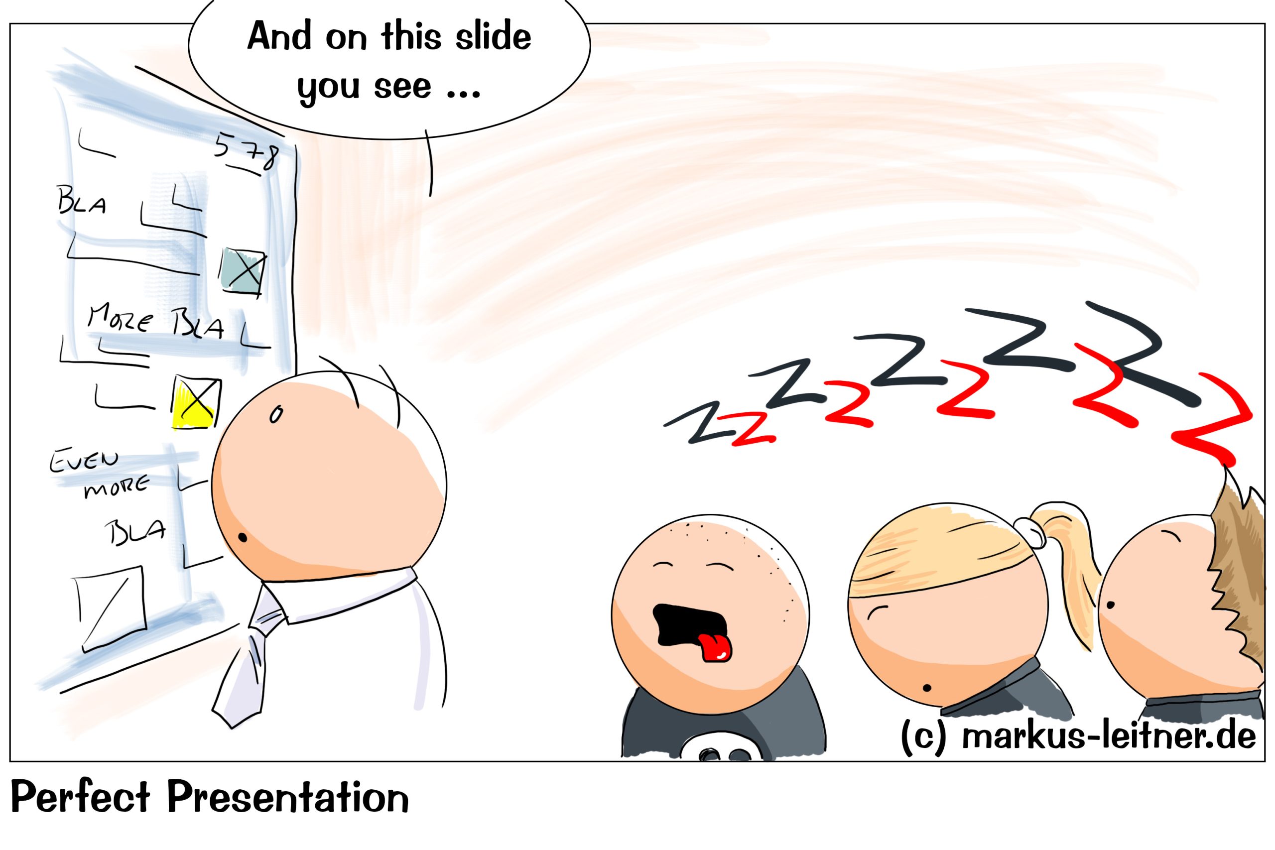
How often do we find ourselves in the situation that we listen to an endlessly boring PowerPoint Presi, trying look very attentive, but are already half asleep inside and tell ourselves that we could do so much better. Oddly, everyone else thinks exactly the same when it is our turn to give our presentation.
To get the possible misunderstanding out of the way right at the beginning: This is by no means about tips and tricks and secret ways and settings in PowerPoint. On the one hand, the whole web is full of instructions and HowTos – so that I cannot possibly add anything to that pile of knowledge (others have a lot more idea), on the other hand, PowerPoint is nothing more than a tool. If I do not know what I am using it for and what I want to achieve, any virtuosity in dealing with any tool benefits me the sum total of nothing.
I would even go so far as to warn against playing too much with the possibilities of PowerPoint, because it is perceived as exactly that: as an unnecessary gimmick that in the worst case (and that occurs much earlier than we would like) distracts from the actual content. There is one thing we must never forget: our viewers are extremely limited in their receptivity.
Here we come to the first important point: reduction.
I know you have a lot to say. I know that you want to share a lot and probably can, but unfortunately your listeners cannot absorb a lot. This is not because we have a herd of idiots in front of us (at least most of the time), but simply because of the natural possibilities of humans. Please do not forget that your listeners are only fed information. They do not work with them. They only have one audiovisual input to process.
Every PowerPoint gimmick, every special page transition, every animation is additional information that has to be processed. Even the unconscious question if that is important, is a form of information processing. That takes resources away from the important information.
Psychology and pedagogy have known for a long time that the information one-way street, i.e. feeding with an audiovisual input, entails high losses. Most of the information falls by the wayside. For us, this means that we not only omit all unnecessary gimmicks (except for the one with which we get our listeners out of their rut), but that we limit ourselves to very few core statements: a maximum of three – no matter how much We have time for our lecture. Anyway, nothing more sticks with our listeners.
The second important point: working out the key messages.
We have a lot to say and we do it often enough. Then we end up with twenty slides, or sometimes a lot more, and all the information on all pages is equally important. It may be perfectly clear to ourselves what our core message is, but our listeners have no inkling of it. First of all, everything is equally important for them because it is presented immediately. For them, the important statements are drowned in the quagmire of the actually supportive statements.
At the end of the day, when we ask our audience what was most important to you, everyone should give the same answer. However, we will find that the answers are very different because we are not giving any clues as to what is really important and thus leaving the audience to decide.
Letting the listener decide what he thinks is important is a very stupid idea. After all, we have a goal. We know what we want to say at the core and, hopefully, also know what we want to achieve with our presentation. So, we have to make sure that our key messages are given special weight.
On the one hand, we make this clear in the slide itself, on the other hand, we should repeat our core statements – possibly at the end in a short summary.
The third important point: reduction of the individual slides.
Nobody likes text deserts. Too much text on a page, or a complex, crammed table, is exhausting and unattractive. We make it twice as difficult for our listener to take in the information. For example, our core message is given an entire page on which there is only a single sentence. Perhaps a supporting illustration, but nothing more than that. We have not only emphasized the key message, we have also simplified the information acquisition.
Not only does it make no sense, it even harms us, if we try to fill individual slides too much. Even when we have a lot to say and show, we always ask ourselves what information can be left out. We do not need more than two or three points to support our core statements. We do not need twenty – that is overfed and overwhelming.
But back to a single slide: we want our viewers to be able to absorb and process the information as easily as possible. To do this, we have to structure it, formulate it in a simple and concise manner and make it as legible as possible, which brings us to the font size, font and color. The simple rule here is: black font (or very dark gray, very dark blue, etc.) on a light background, simple reading font (i.e. no Fraktur or such nonsense, meaning no fonts that are intended for headlines), and last but not least, a comfortable reading size.
The fourth important point: a presentation follows a dramaturgy.
Ideally, we are telling a story in some way. Our statements and the associated slides build on each other and end with the core statement. In a way they lead us to our core message through two or three inferential pieces of information. If we have more than one of these key messages, the game begins again. We build up (little) information on each other again until we get to the next one. This is over after three at the latest, because our listeners cannot take in more than three statements anyway.
However, we need the derivation of these key messages in order to give them more weight.
We knit a kind of frame around the actual content, starting with an introduction in which we briefly explain to our listeners what the purpose of this presentation is. Then maybe a little look at the context and framework conditions so that the following statements can be put into a larger picture.
We also have an end in which we repeat our key messages again before we thank our listeners for their attention and come to the closing. At the end, we also include the offer to speak to us directly if there are any further questions. Here we refer to files and storage locations etc. for those who want to delve deeper into the subject.
The fifth important point: why the whole thing
As already briefly said, we have an introduction in which we emphasize the motivation for this presentation. Do we want to prepare a decision? Which? Do we just want to inform? Why?
This information helps our viewers to classify what they are about to see. It gives context. Here we also give them the opportunity to make their own first decision. Perhaps they are not interested in pure information, but they do pay attention when it comes to preparing a decision. We cannot make this decision for anyone, and neither should we try. Listen – this is important for you is a very stupid idea. With our introduction we make it clear for whom it is important and why.
And finally, the most important thing: ourselves.
Our colleagues can read themselves. If I just read what is on the slides, I can save myself that. It just makes it very boring for everyone else. We should realize much more that we have two ways of conveying the same information: the visual via our slides and the acoustic via our voice. If both are absolutely identical, we are wasting a lot of potential. So, I should try to use my voice to express the statements on the slides in other words. This is one of the few chances I have of increasing the intake of information.
To do this, it is of course necessary to speak freely. This is not easy for everyone, but it can be trained. The more insecure I am about it, the more aids I need – for example in the form of small moderation cards, and the more I should perhaps practice my presentation beforehand.
Just one example: I do not find it difficult to speak freely. Still, I give each presentation at least three times. Once live, when it counts, and twice or even more times when I am on the road. I spend a lot of time on the freeway. Then the presentation runs completely in the head while driving. I speak loudly while doing this. Nobody else can hear me in the car.
Practice helps.
Also get feedback on your voice. Even if we believe that we are speaking loud and clear, our viewers may see it very differently – and that is what matters in the end.
And by the way: do not try too much to interact with your audience. Always looks stupid when nobody joins in.
Core: We reduce our presentation to a few key statements that we specifically work out. Each presi follows the dramaturgy of the introduction, derivation of the core statement, core statement itself and conclusion with a summary and reference to further information or possibilities for direct contact.
If you need any assistance or want to know more, just speak to me.


